top of page


EVENT INVITE
For this assignment, I had to create a social media invitation using the design elements C.R.A.P. (contrast, repetition, alignment and proximity). Down below you'll be able to see my first initial design compared to what the final product turned out to be.
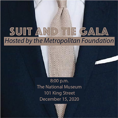
before
For my original design, I was inspired by the suit and tie picture, which guided many of my design decisions. Since the photo is a closer shot, I was somewhat constricted in the colors I could use for the text. I mainly stuck to center alignment, as I wasn't sure how to place the elements on top of the image in a way that would make it clear and readable with all the different background colors throughout.
Because of this, it also made most of the text harder to read, which I tried to solve by putting boxes behind text. I picked the colors in the design based on the photo, recognizing that the navy brought the regal feel needed to promote the gala. I also chose the photo I did, knowing that the colors navy and tan are opposite from each other on the color wheel, providing good contrast.
For the fonts, I wanted to choose two (one for the main title and another for the smaller details). One is more specialized, representing the fancy aspect of the gala, while the second is a simple San Serif font to bring contrast.

after
With my re-design, I wanted to focus more on improving contrast, repetition, alignment and proximity. I knew I wasn't going to stay with the original photo I picked as the background, as it appeared to be too low-quality, blurry and busy. With this picture as inspiration, I decided to create the tie as the primary graphic.
For the color palette, I mainly stuck to what my original design was. After designing the tie, I decided to add stars and changed some of the text to white, so that the design featured more repetition both in color and shapes. With the information about the event, I also chose to break up that content, as it was too crowded in my original design, which provided more clarity and cohesiveness through repetition.
Lastly, the second design also uses left alignment, adding more unity, balance and space between elements. For proximity, I spaced elements out based on how alike they were to one another. This consisted of keeping the event information together, while moving the event title further up in the design. I chose to keep the tie on the left, as it acted as a unifying object between the different elements.
bottom of page