top of page


MOVIE POSTER
For my Visual Communications class, I had to create a series of three posters for different movies using a conceptual, minimalist, vector approach. Without using photography or any external illustration, the main goal was to capture key imagery from each film while keeping the design simplistic. With this project, I chose to recreate The Sound of Music, Singin' In The Rain and The Wizard of Oz, as I'm a big fan of musicals, especially the older, classic ones that never go out of style. All pieces and designs in this project were created from scratch using tools in Adobe Illustrator.
sketches
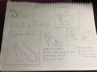
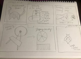

At the start of this process, I realized that I wanted to do something with Disney, as I knew there were iconic objects in those films that I would be able to recreate. The sketches shown above illustrate the different films I thought of designing movie posters for. After going through the process of formstorming, I ultimately decided to switch to older, classical musicals, as I felt that would be a more unique and challenging route.
first designs
For The Sound of Music poster, I knew I wanted to include the mountains and hills, as that was a major part of the imagery that was used in the film. It wasn't until I was working on the Singin' In the Rain poster when I developed the idea of using music notes as another main element in the poster series, with the notes representing raindrops for Singin' In the Rain and then showing that "the hills are alive" in the Sound of Music. With this concept, it also further displays the importance of music in these two films. With the third poster for The Wizard of Oz, I knew I wanted to do something with the yellow brick road. After trying some different things, I ultimately decided it worked best if the road lead somewhere, which made me think to add in the Emerald City.
I specifically chose to use blue, green and yellow pastel colors, as each of those represented different key imagery/elements in each film. This choice also made it possible to bring a sense of cohesiveness among my overall project. For the fonts, I used the same Sans Serif for each "a film by" description. With the movie titles, I tried to keep them simple, so that they wouldn't distract from the overall poster. This being said, I also worked to find fonts that reflected the ones used in the original movies.


Later on in the class, I had to revisit project 2, where I created a series of three movie posters using a conceptual, minimalist, vector approach. While the main goal for the first project was to capture key imagery from each film and keep the design minimalist/simplistic, this second project involved taking the vector elements from Illustrator and editing them through Photoshop. The main goal was to explore Photoshop's multitude of tools. With my personal designs, I focused a lot on creating different textures and experimenting with selection tools, creating masks, adding layer effects and warping text.
photos used for second design


final designs


bottom of page